- Home»
- EverQuote Pro Blog»
- 7 Inspiring Insurance Agent Website Examples
7 Inspiring Insurance Agent Website Examples

When you originally created your website, probably the first things that came to mind were visual elements—layout, color palette, font, etc. In reality, for insurance websites, visual appearance isn’t always the most important aspect of design. Lead generation is most important; a beautiful site that doesn’t generate leads won’t do you any good.
In this article, we’ve compiled some insurance agent website examples that effectively generate insurance leads, and explain why they work no matter which visual elements they use.
7 Insurance Agent Website Examples and Best Practices to Replicate
The following examples include the best insurance agency websites submitted from marketers and insurance agents in the industry.
Hopefully this list will provide some design inspiration, helping you think beyond visual appeal so you can focus on things like generating more leads or growing an email list.
1. Adler Insurance: Make local SEO a top priority.
Adler Insurance is a local insurance agency based in Denver. It’s an attractive site, but the most critical part of this site design has absolutely nothing to do with visual elements but rather whether or not its pages are optimized for search engines.
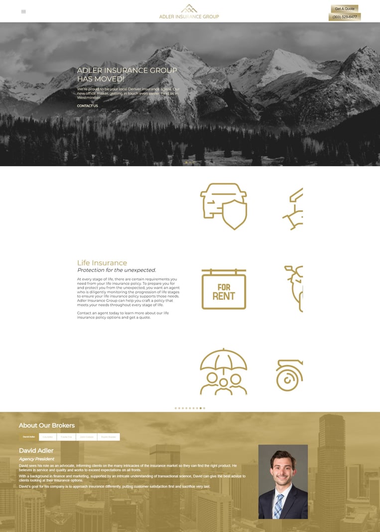
David Adler, President and Owner of Adler Insurance Group, knows that local competition is fierce. The best insurance website design examples on this list compete by focusing on search engine optimization (SEO).
"Most insurance agencies are small businesses that operate in one geographic area on the behalf of larger insurance companies,” Adler says. “That means your new website will have stiff competition in the local area, even prior to launch, and that can make it very difficult to rank well in local search queries—especially when you consider the fact that your site is starting out with no traction in the online space.”
Adler recommends getting an overview of the competitive landscape first. Find out which search terms your competition ranks for, especially local key phrases, like “Denver insurance.” If you’re new to web design, it might be helpful to seek out the services of an SEO professional.
“Just remember that SEO will take time, and you'll likely need to continue publishing relevant content on your website to steadily improve your search engine rankings,” Adler says.
Interested in learning new and innovative ways to find and process insurance leads? Contact the experts at EverQuote Pro for a consultation.
2. Texas General Insurance: Modern design makes a difference.
To the greatest extent possible, Texas General Insurance uses technology to enhance the customer experience, both in the sale of their products and on their website. In their view, it’s important that clients feel comfortable when they arrive on your homepage, and that your site doesn’t feel outdated.
"From my experience as an insurance agent, many insurance websites are outdated and uninviting,” Nick Schrader, insurance agent at Texas General Insurance says. “You need a website builder that has the necessary functionality and the right templates and customization tools. On every insurance website, there should be a homepage that tells people who you are and what you do.”
The best insurance agency website design examples have a nice front page. The front page of your website should be attractive (using high-quality images) and modern, and include precise details about your product.
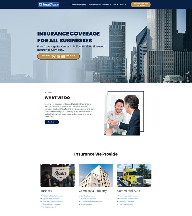
Schrader also cited the importance of an About page, which should act like an introduction to yourself and your staff. The most critical goal here is to highlight your staff’s experience and to differentiate yourself from your competitors.
Texas General Insurance highlights the agency’s experience navigating technological changes in the insurance industry:
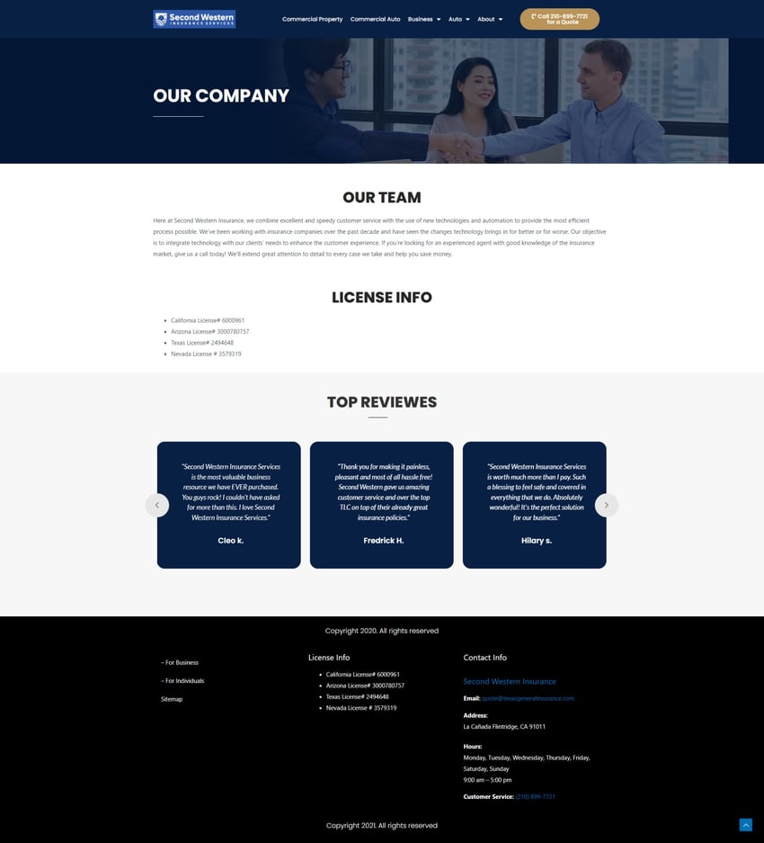
Finally, Schrader noted the importance of clearly indicating how potential customers can get in contact with you, whether that’s a phone number, contact page, social media profile, or all three.
“You can use either a header or footer to show [a contact] link on every page, but you should also have a dedicated page with this information which offers people a way to message your company. Provide links to your social media websites and use your website to increase your email list. Visitors may not be ready to commit to an insurance plan, but you can get them to join your community with an opt-in email form."
3. Seniors Mutual: Write articles that answer specific questions.
Seniors Mutual specializes in helping seniors find the best and cheapest final expense life insurance, Medicare, and annuity coverage that fits their unique needs.
The most important part of the agency’s website is its content: articles that are written to answer very specific questions their target customers may have. This allows them to bolster their SEO strategy and drive more leads.
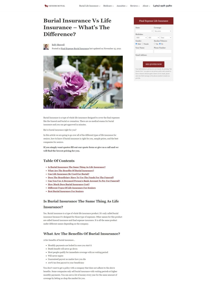
Kelly Maxwell, CEO of Seniors Mutual, stressed the fact that SEO is a long game—it may take nine months to a year before you start to see results.
“You have to find very specific questions that people want answered, such as insurance for cancer or a review of a single company. Even that may be too broad. The more specific the better, especially when you’re starting out.”
Part of Maxwell’s strategy is to increase the number of links from other sites to her articles, which is where she spends most of her time—not on content creation.
4. Argo Group: Keep navigation simple.
Argo Group’s focus is specialty insurance, and on their website, they focus on simplicity. They prioritized easy navigation and a simple site structure so that no visitors would ever be confused about where to go next.

"A lot of insurance sites have way too many tabs in their navigation menu which can easily be combined,” Mehvish Patel, SEM team at Zen Media says. “Instead of a homepage full of cluttered information on a heap of different types of insurance, it should be kept simple with a relevant landing page. This way, not only are new consumers finding the modern design easier to understand, but the site in itself functions better and faster."
5. Insurance Providers: Honest information builds trust.
Insurance Providers isn’t an insurance agency, but insurance agents can still learn something from their website. Instead, their website allows customers to compare insurance quotes and companies, and review insurance agents.
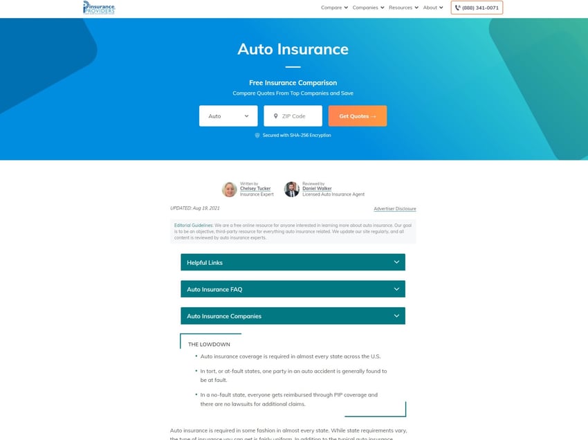
On their site, Insurance Providers focuses on providing honest and valuable information for insurance consumers in a clear, succinct format. This builds trust with their audience and consumer, and creates a strong brand for them.
"Let the consumer know about the upsides to your agency,” Shawn Laib, an insurance expert with InsuranceProviders.com says. “For example, be honest about the consequences of auto accidents on coverage. Tell customers that one at-fault collision can raise their coverage by $64 a month. Explain in layman’s terms what the pros and cons of certain policies are.”
Once you’ve built trust with honesty, you can highlight what you do better than other companies, and eventually make a sale. Laib also noted the importance of simple site design:
“Use simple color schemes on the website. White backgrounds with some clean animations will draw attention to the important things on the screen while also helping your company look professional, yet fun and accepting of new customers."
6. Feather Insurance: Use digital tools to help customers with claims.
Feather Insurance focuses on relieving people of the burden of researching and purchasing insurance policies in an effort to give people what they need: honest, simple insurance in the German insurance market.
Its site has a clean, modern design and they prioritize site speed, which is critical to increasing the number of leads a website generates.
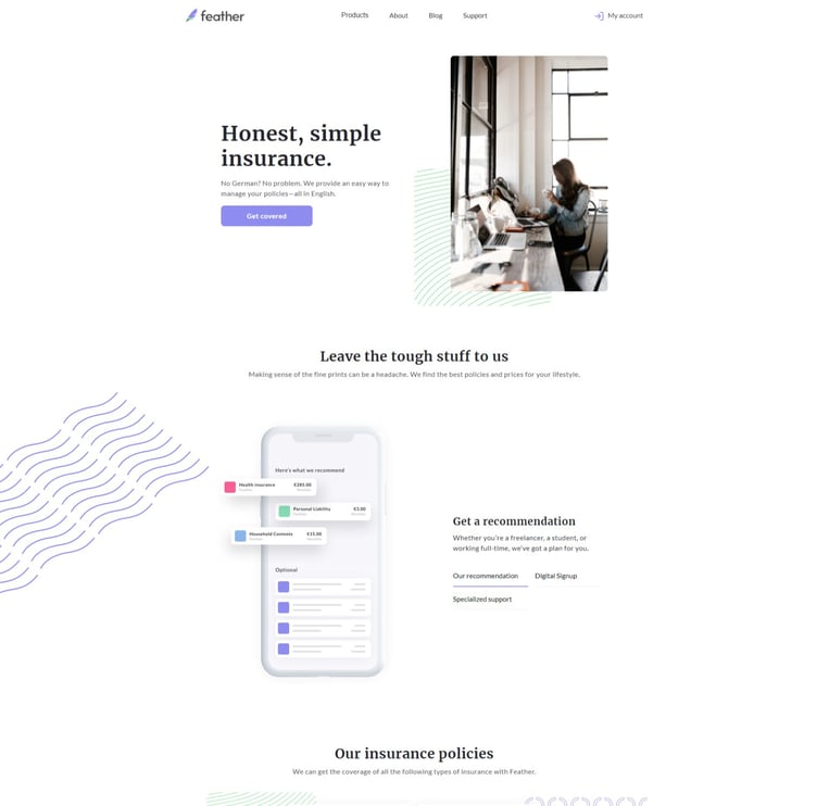 They also provide tools for customers to use that remove the need to speak with a representative, if that’s their preference.
"We’ve developed digital tools that include a digital claims process,” Bobbi Steele, Copywriter at Feather Insurance says. “This way, no one actually needs to call in or chat online to file a claim (although both are options on the website when desired).”
7. Lemonade: Simplify insurance terms so everyone can understand.
Lemonade offers renters, homeowners, car, pet, and life insurance in the United States; contents and liability insurance in Germany and the Netherlands; and renters insurance in France.
They're focused on making insurance as simple as possible so that consumers understand exactly which policy is the best for them.
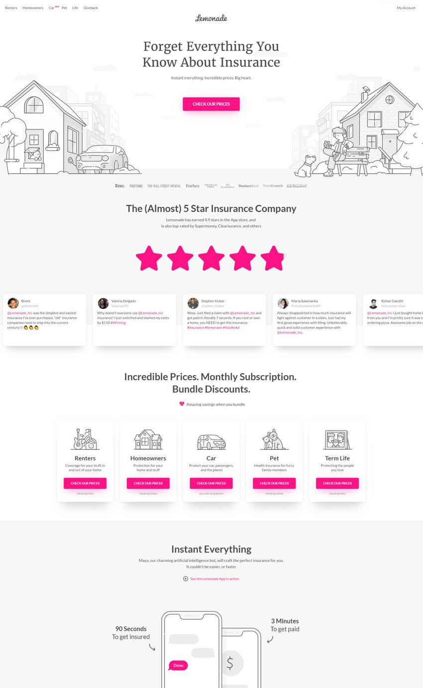
For those who don’t work in the field, insurance terms are complex. Lemonade’s site makes insurance seem less intimidating, and presents the company as an ally who can guide customers through the purchasing experience.
The best insurance agency websites take more than just design into account.
Whether or not the visual elements of your website look good will always be partly subjective. But visual appeal isn’t everything. As shown in these examples, what’s most important is that you clearly communicate pertinent information to your website visitors and make it easy for them to take the action you desire, whether that’s a requested claim, a phone call, or something else altogether.
If you’re looking for new ways to generate leads with your insurance agency website, contact the experts at EverQuote Pro for a consultation. And if you know of a great insurance agent website example we missed, leave a comment and let us know!
Unlock predictable growth with EverQuote.
Our representatives are standing by to help you succeed.
Call 844-707-8800
Weekdays, 9AM-5PM (ET)
Call 844-707-8800
Weekdays, 9AM-5PM (ET)
Accelerate your growth.
Complete the form below or just call 844-707-8800 to learn how we can help you achieve your goals.
By clicking "Get Started", I consent by electronic signature to being contacted by EverQuote, including by automatic telephone dialing and/or an artificial or prerecorded voice (including SMS and MMS - charges may apply), regarding EverQuote for Agents, even if my phone number is listed on a Do Not Call Registry. I also understand that my agreement to be contacted is not a condition of purchasing any goods or services, and that I may call (844) 707-8800 to speak with someone about EverQuote for Agents.
By clicking "Get Started", I affirm that I have read and agree to this website’s Privacy Policy and Terms of Use, including the arbitration provision and the E-SIGN Consent.
* Mandatory fields
 Product Overview
 Blog
Blog FAQs
FAQs Webinars
 eBooks & Resources